

It’s been a few years since I first wrote about how to properly put together a logo package for clients and I’ve received a ton of positive feedback from clients and designers alike. It’s a topic that often gets overlooked despite its importance. I mean, what good is a logo if it doesn’t have the structure, variations, and versions for every occasion? Is it for print? Is it for digital? Landscape or portrait? The list goes on.
With more experience under my belt and a series of new asks from clients, I wanted to share how I’ve updated my process to make the client experience even better. So, what’s the best way to organize your logo files in 2020? Which file formats should you include? How many logo variations should you provide? Let’s dive in.
LOGO PACKAGE FOLDER STRUCTURE
Before we start creating files, let’s set up the folder structure. Below is a breakdown of folders inside your zip file. I’ve found this structure to be the most logical for clients to help them navigate the multiple versions of their files. The logo variations folder will include all the different arrangements of your logo. The next section divides your files into digital and print purposes. Your color variations folder will include the color options available. Finally, the relevant file types your client will need.
![]()
LOGO VARIATIONS
With all the different platforms and mediums a logo can be used for, one style just won’t cut it. The number of variations will depend on the complexity and components of the design. For example, some logos may have a tagline to work with. On the flip side, some logos may have an icon that can exist both with and without accompanying text. With multiple styles to choose from, providing a brand guidelines document can be helpful to your client in guiding them on when and how to use each one.
WHAT LOGO VARIATIONS SHOULD YOU PROVIDE?
- 1. Vertical Orientation
- 2. Horizontal Orientation
- 3. Brandmark or Icon
- 4. Wordmark
VERTICAL/HORIZONTAL
When designing a logo, consider creating horizontal and vertical versions, as different situations will call for different orientations. For websites, a horizontal version is typically best, but a vertical or stacked style might work better for your signage or collateral pieces. With that said, some logos will only have one orientation.
BRANDMARK OR ICON
Brandmarks or icons without text are great for swag, social media accounts, or when the main logo looks too small. If your logo doesn’t have an icon, develop one for those specific situations. For example, Facebook uses an ‘f’ in a circle for their icon, but their main logo is a wordmark.
WORDMARK
This is probably the least popular version your client might use. Nonetheless, it can be still useful to include scenarios where there is limited space.
![]()
COLOUR SPACES
A common question I’m asked is what file do I use for print? Not everyone will know the difference between RGB, CMYK, or Pantone. So I’ve divided them into their respective digital and print folders. Both folders are set up very similarly with a few key differences.
Your digital folder will contain both image files and vector files. Your print folder will only contain vector files that are separated into CMYK and Pantone folders. Now you might be wondering, why do I need vector files for digital if I don’t need to print them? It’s handy to have vector files in RGB in case your client wants to export different formats or sizes that are not included. Basically, a vectorized logo keeps you flexible.
CMYK printing will typically be used the most by clients, but it’s important to include Pantone versions as well. For more information on Pantone colors, check out keeping color consistent across print and digital.
![]()
COLOUR VARIATIONS
Your client’s logo will not always be in full-color on a white background so it’s important to provide a variety of options for different scenarios. If their logo is going on a dark background, they will need an inverse or white option. If they can only print one color, they may need a solid black version. Depending on the nature of the logo itself, you may have more or fewer versions than what you see below.
HOW MANY COLOUR VARIATIONS SHOULD YOU INCLUDE?
- Full-colour
- Inverse
- Black
- White
![]()
WHAT LOGO FILE FORMATS SHOULD BE INCLUDED?
There are all kinds of file formats out there but giving a client too many options can overwhelm them. These file formats are the ones that will meet the majority of client needs:
- Adobe Illustrator (AI)
- Editable PDF
- EPS
- SVG
- JPEG
- PNG
VECTOR FORMATS
For the longest time, the standard for supplying logos was an EPS file and some would argue it still is. However, with changing technology, EPS files are a dying format and becoming outdated. PDF files are becoming the standard universal file format because of their versatility. Make sure when you’re exporting PDFs that they are editable for the client. That being said, I would still include an EPS file as some print shops with older software still request them.
SVGs are great for website design as they keep logos and icons sharp and are infinitely scalable without pixelation. This is especially noticeable with higher resolution displays over 1080p. It’s also a good idea to include the original AI file so the client can make edits or export additional formats in the future.
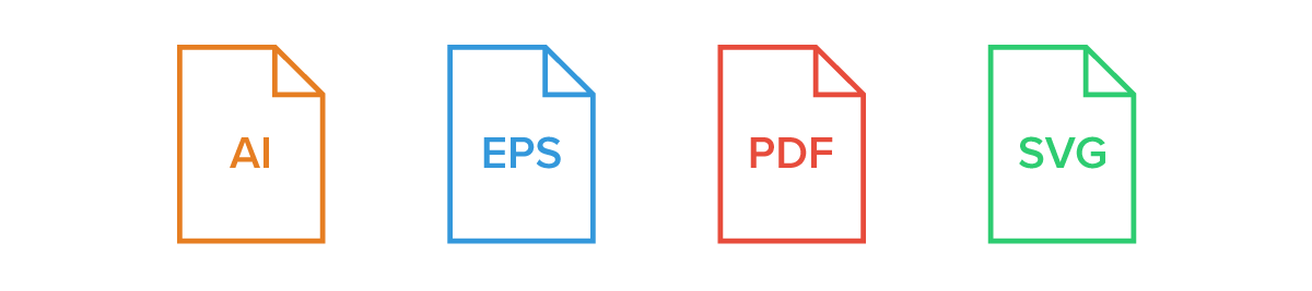
IMAGE FORMATS
There are many different image types but providing both JPEGs and PNGs in your logo package should be sufficient. I like to include PNGs in addition to JPEGs because they have a distinct advantage using transparent backgrounds which can come in handy. These files will only be needed in your digital folder. I like to keep my image files in a separate folder from my vector files to keep things simple and organized. With all the different file types and image sizes, it can get a little messy if you throw them all together.

IMAGE SIZES
When it comes to specific dimensions, there isn’t really a standard you need to follow, this is more of a recommendation from my experience. I typically scale the largest size to 1920×1080 which fits a common 1080p display. Because clients will sometimes use their logo on a fullscreen for presentation purposes or at an event, I find this to make the most sense for the largest size. However, although in it’s early stages, 4K displays are quickly becoming the norm. If you want to be a little ahead of the curve, you can include a 4K (3840×2160) size for your client.
Now depending on the orientation of your logo, it may be wider than tall or vice versa. If it’s wide, scale to 1920px wide. If it's tall or more square, I usually size to the height of 1080px as seen below.
![]()
In addition to a large logo size, I also include a medium and small version. The reason for this is clients often use their logo in email signatures which can be quite small. Using a large logo that’s scaled-down just adds unnecessary file size which can cause issues with size limits on certain platforms. For a medium-size, I scale 50% of the largest size and 10-15% for the small as seen below.
![]()
You may be wondering, should I include both 72 DPI and 300 DPI images in my logo package? I typically only provide 72 DPI files (low res) because they’ll work for the majority of web purposes while keeping the file size down. Conversely, a 300 DPI (high res) image is needlessly large and will lead to a slower web experience. In the event that there is a scenario where you need a high-resolution image of the logo (typically for print) a vector file should always be used.
NAMING STRUCTURE
Having a proper naming structure is not only good practice, but it will also be helpful to identify each file properly. Below is an example of how I prefer to label my files. I start with the client’s name (Stryve), followed by the logo variation (Vertical, Horizontal, etc.), the color space (RGB, CMYK, or Pantone), and finally the color variation (Black, white, or inverse).
![]()
INCLUDE A LOGO PACKAGE GUIDE
Have you ever tried to put IKEA furniture together without the instructions? Sure, putting together a coffee table may seem straightforward at first. Wait, why does this table have 87 parts?! And just like you aren’t an expert in assembling IKEA furniture, your client probably isn’t as well-versed in file formats, color spaces, or when to use them. Including a quick guide that briefly outlines the difference between each file type and when they’re used will give them the tools to use their new logo effectively.
![]()
Putting together a logo package for a client can be a time-consuming process and some of it might feel like overkill. However, you have to remember that your client is likely not as familiar with graphic files as you are. Keeping things labeled and organized will make it easier for them to use files correctly and navigate what is what. It will also save you from having to answer questions about what logo to use down the line.


)
0 Comments